Example: Developing a YAML Config for a Standard Plot
This notebook demonstrates how to create a new standard plot with a .yaml config file. When placed in a proper directory, the config file can be plotted by name using the method AnalyzeTimeSeries.plot_time_series_multipanel() and will be included in the “plot all” method AnalyzeTimeSeries.plot_all_quicklook().
[1]:
from modules.quicklook.src.analyze_time_series import AnalyzeTimeSeries
from datetime import datetime
%matplotlib inline
Load the database by creating an AnalyzeTimeSeries object. (You can also use db_path = 'kpf_ts.db' to use a SQLite version of the TSDB.)
[2]:
myTS = AnalyzeTimeSeries(backend='psql')
INFO: Starting AnalyzeTimeSeries
INFO: Starting KPF_TSDB
INFO: Jupyter Notebook environment detected.
INFO: Base data directory: /data/L0
INFO: Backend: psql
INFO: Table prefix: tsdb_
INFO: PSQL server: 127.0.0.1
INFO: PSQL username: timeseriesdba
INFO: PSQL user role: admin
INFO: Metadata table exists.
INFO: Metadata table read.
INFO: Data tables exist.
To build a new .yaml config file, it’s helpful to start with an example (see below). Copy an example file to a subdirectory of KPF-Pipeline/static/tsdb_plot_configs/ and start modifying. (Note that the subdirectory that it is copied to must have an __init.py__ file in it for AnalyzeTimeSeries to pick it up automatically.)
Next, see what the config file produces. For example, the file KPF-Pipeline/static/tsdb_plot_configs/autocal-etalon_snr.yaml makes the plot below.
[3]:
start_date = datetime(2024, 10,  5)
end_date   = datetime(2024, 10,  6)
myTS.plot_time_series_multipanel('autocal-etalon_snr', start_date=start_date, end_date=end_date, show_plot=True, clean=True)
INFO: Plotting from config: /code/KPF-Pipeline/static/tsdb_plot_configs/Cal/autocal-etalon_snr.yaml
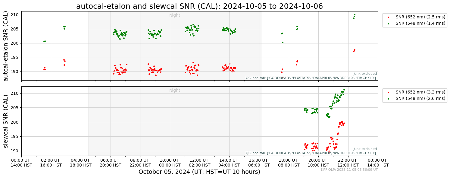
The .yaml file that produced that output is shown below. Note that there are two panels specified. In the first panel, the TSDB columns SNRCL548 and SNRCL652 are plotted vs. time. Other parameters of the panels are set in the panelvars including the plot type (scatter) and plotting attributes (label, plot point characteristics). The section paneldict has a set of keyword/value pairs that specify the shared vertical axis label, criteria for including data in the panel (not
marked ‘Junk’ and not failing a set of QC tests indicated by their keywords), and the set of OBJECT names for data to be included in the plots (only_object).
[4]:
!cat /code/KPF-Pipeline/static/tsdb_plot_configs/Cal/autocal-etalon_snr.yaml
description: autocal-etalon and slewcal SNR
plot_type: time_series_multipanel
panel_arr:
  - panelvars:
      - col: SNRCL548
        plot_type: scatter
        plot_attr:
          label: SNR (548 nm)
          marker: .
          linewidth: 0.5
          color: green
      - col: SNRCL652
        plot_type: scatter
        plot_attr:
          label: SNR (652 nm)
          marker: .
          linewidth: 0.5
          color: red
    paneldict:
      ylabel: "autcal-etalon SNR (CAL)"
      not_junk: true
      qc_not_fail: 'GOODREAD, FLXSTATS, DATAPRL0, KWRDPRL0, TIMCHKL0'
      not_junk: true
      legend_frac_size: 0.20
      only_object:
        - autocal-etalon-all-night
        - autocal-etalon-all-eve
        - autocal-etalon-all-morn
  - panelvars:
      - col: SNRCL548
        plot_type: scatter
        plot_attr:
          label: SNR (548 nm)
          marker: .
          linewidth: 0.5
          color: green
      - col: SNRCL652
        plot_type: scatter
        plot_attr:
          label: SNR (652 nm)
          marker: .
          linewidth: 0.5
          color: red
    paneldict:
      title: autocal-etalon and slewcal SNR (CAL)
      ylabel: "slewcal SNR (CAL)"
      not_junk: true
      qc_not_fail: 'GOODREAD, FLXSTATS, DATAPRL0, KWRDPRL0, TIMCHKL0'
      legend_frac_size: 0.20
      only_object:
        - slewcal
The full set of parameters that can be included in the .yaml files is listed in the docstring below.
[5]:
help(myTS.plot_time_series_multipanel)
Help on method plot_time_series_multipanel in module modules.quicklook.src.analyze_time_series:

plot_time_series_multipanel(plotdict, start_date=None, end_date=None, hatch_service_missions=True, clean=False, fig_path=None, show_plot=False, log_savefig_timing=False) method of modules.quicklook.src.analyze_time_series.AnalyzeTimeSeries instance
    Generate a multi-panel time series plot from a KPF TSDB. Each subplot is configured
    via a dict (or YAML file path), enabling control over filters, transforms, and style.

    Parameters
    ----------
    plotdict : str or dict
        Path to a named YAML config or a dict with key 'panel_arr' (list of panel dicts).
    start_date, end_date : datetime, optional
        Query window (UT). Defaults if None: start=2020-01-01, end=2040-01-01. The code
        may tighten to the data’s min/max timestamps.
    hatch_service_missions : bool, default=True
        Overlay hatched spans from self.get_service_mission_df() (UT_start_date, UT_end_date).
    clean : bool, default=False
        Apply self.db.clean_df() to remove outliers.
    fig_path : str, optional
        Full output path (PNG).
    show_plot : bool, default=False
        Show the figure interactively.
    log_savefig_timing : bool, default=False
        Log CPU time for savefig().

    Plot Configuration (via panel_dict or YAML)
    -------------------------------------------
    plotdict['panel_arr'] : list[dict]
        Each element defines one panel and includes:

        - 'paneldict' : dict   # panel-level behavior/filters
            - 'only_object' : str | list[str]          # exact OBJECT names
            - 'object_like' : str | list[str]          # LIKE patterns (nested lists ok)
            - 'only_source' : str                      # passed to DB filter layer
            - 'not_junk' : bool | {'true','false'}     # filter on NOTJUNK
            - 'qc_pass' : str | list[str]              # columns that must be True
            - 'qc_fail' : str | list[str]              # columns that must be False
            - 'qc_not_pass' : str | list[str]          # columns that are not True (False/NaN)
            - 'qc_not_fail' : str | list[str]          # columns that are not False (True/NaN)
            - 'on_sky' : bool | {'true','false'}       # True→FIUMODE=='Observing', False→'Calibration'
            - 'ylabel' : str                           # label for vertical axis
            - 'ylim' : tuple | str                     # (ymin, ymax) or a string that evals to that
            - 'ymin', 'ymax' : float                   # override parts of ylim
            - 'yscale' : str                           # e.g., 'log'
            - 'subtractmedian' : bool                  # subtract per-variable median before plotting
            - 'nolegend' : bool                        # suppresses legend
            - 'legend_frac_size' : float               # legend anchor offset
            - 'axhspan' : dict                         # {key: {'ymin','ymax','color','alpha'}}
            - 'title' : str                            # title for a set of panels
            - 'narrow_xlim_daily' : bool               # shrink x-limits to data for day-scale plots

        - 'panelvars' : list[dict]   # variables drawn in this panel
            - 'col' : str                                # main data column
            - 'col_err' : str                            # symmetric error column (optional)
            - 'col_subtract' : str                       # subtract this column from 'col'
            - 'col_multiply' : float                     # scalar multiplier
            - 'col_offset' : float                       # scalar offset
            - 'normalize' : bool                         # divide by median after transforms
            - 'plot_type' : {                            # determine plot type
                 'scatter',                              # scatter plot (default)
                 'errorbar',                             # errorbar plot; must include 'col_err'
                 'plot',                                 # line plot
                 'step',                                 # step plot
                 'state',                                # state value plot with distinct values, usually strings or booleans
                 'vlines'                                # plot with vertical lines; must include 'col_min' and 'col_max'
                 }
            - 'plot_attr' : dict                         # matplotlib kwargs (marker, label, etc.)
            - 'unit' : str                               # used when augmenting legend label with RMS
            - 'col_min','col_max' : str                  # required for plot_type='vlines'
            - 'vline_pt_color' : str                     # optional color for vline end points

    Returns
    -------
    None
        Saves to fig_path (if given), optionally shows, and logs as configured.

    Notes
    -----
    - Time axis adapts to span:
        * ~1 day: hours since start (UT/HST labels possible), optional “Night” shading
        * <3 days or <32 days: days since start
        * 28–31 days: month view (day numbers)
        * ~1 year: month tick marks with MM-DD labels
        * longer: calendar dates (YYYY-MM-DD)
    - 'state' plots render categorical levels; {0,1,None}→{Fail,Pass,None}. If ylabel=='Junk Status',
      {Pass,Fail}→{Not Junk,Junk}.
    - Empty selections are annotated “No Data”.
    - Labels may be augmented with “(X unit rms)” when legend shown and enough points exist.
    - Data come from self.db.dataframe_from_db(...); DATE-MID parsed and sorted; clean_df() optional.